A Escrita
Editorial Design, 2010
Editorial Design, 2010
A Escrita began as a personal question rather than a brief. Could a book about writing itself be designed so the form argues alongside the words? Where language, alphabets, and meaning are the subject, could layout, color, and typography carry part of that argument instead of just presenting it?
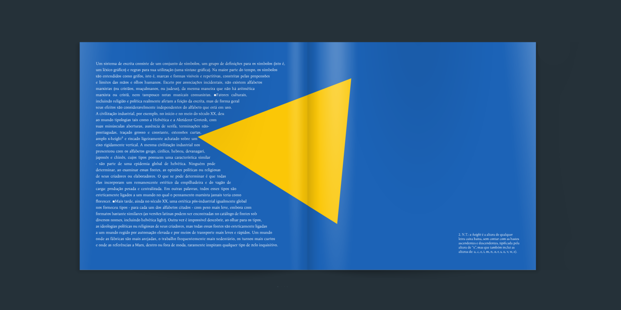
Each movement of the text lives on its own color. Red, gold, and blue gradient spreads mark shifts in the argument, with a hand-lettered red and blue title page opening the book. Serif body copy carries the essay while bold display lines pull out its key claims, and translator's footnotes sit quietly in the margins. At key turns the typography acts out the ideas themselves. A word is split apart across a spread, a passage is struck through, another is recast entirely in coded symbols in place of letters.
Completed as a self-authored editorial design exploration, a finished book where typography and color don't just present a text about writing, but enact it.