Natura Aquarela
Packaging Design, 2011
Packaging Design, 2011
A color cosmetics line spans very different product types and sizes, from a multi-shade eyeshadow palette down to a single gel eyeliner. The packaging needed to read as one family across that whole range, stand out on a crowded beauty shelf, and still feel true to Natura's brand.
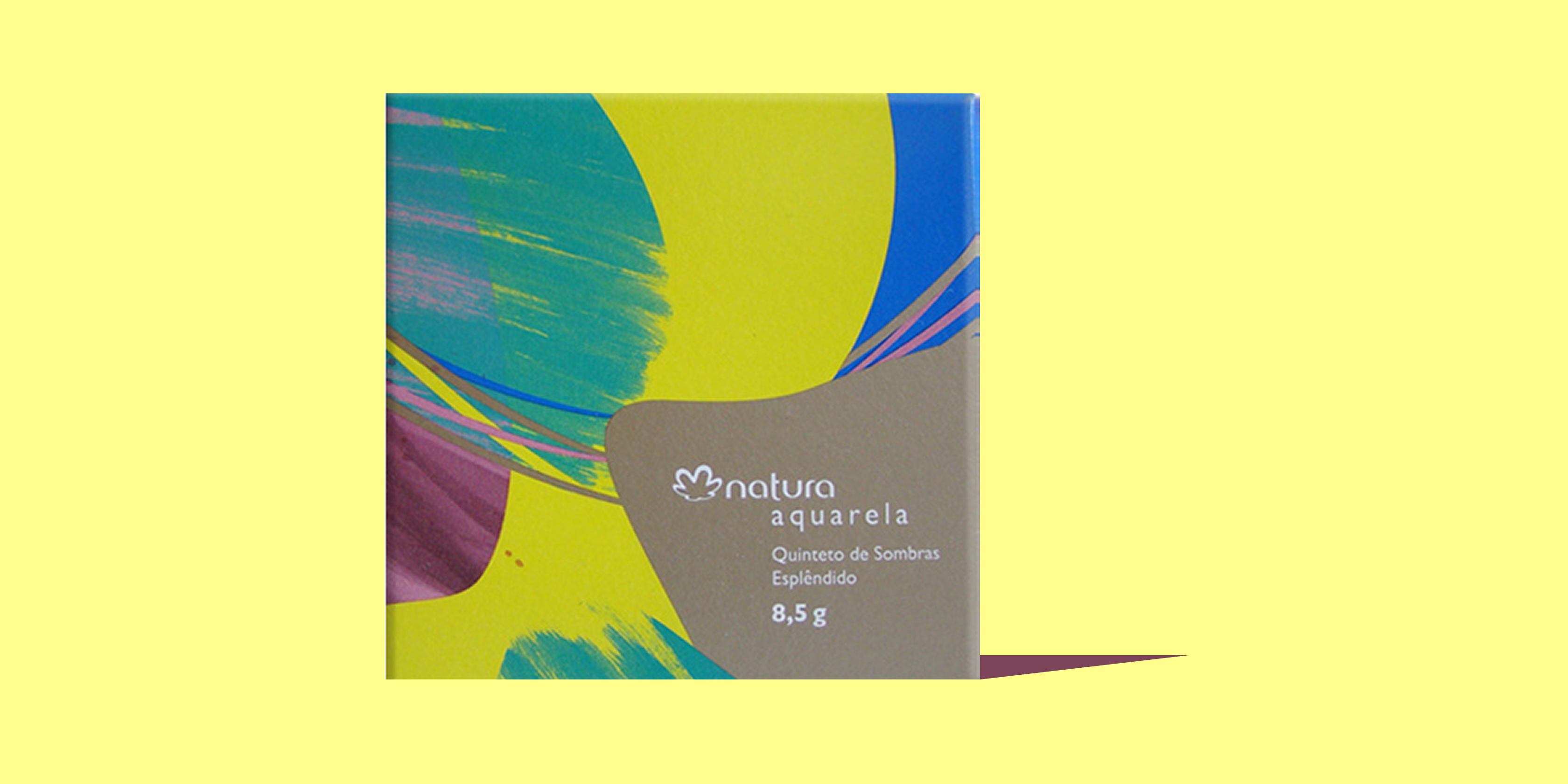
A watercolor brushstroke identity, with sweeps of teal, chartreuse, blue, and magenta over a kraft-toned base, gives the "Aquarela" line its name and its shelf presence. The same rounded logo tag and artwork wrap consistently across every format, from the Quinteto de Sombras Esplêndido palette to the Delineador em Gel liner, the Blush Duo Idolatrado, and the Sombra Pigmento, each scaled down from the same master graphic.
The result is a packaging system that scales cleanly across four product formats and five SKUs, from the 8.5g eyeshadow quintet to the 1.5g gel eyeliner, while reading instantly as a single, cohesive collection.