BloomPomPom
Branding, 2025
Branding, 2025
A friend and food/restaurant photographer was investing seriously in her business for the first time and needed a full identity to match, including a logo, business cards, Instagram post templates, a price chart, and story highlight icons. It was built as a freelance project run entirely over chat, moodboards, and iteration.
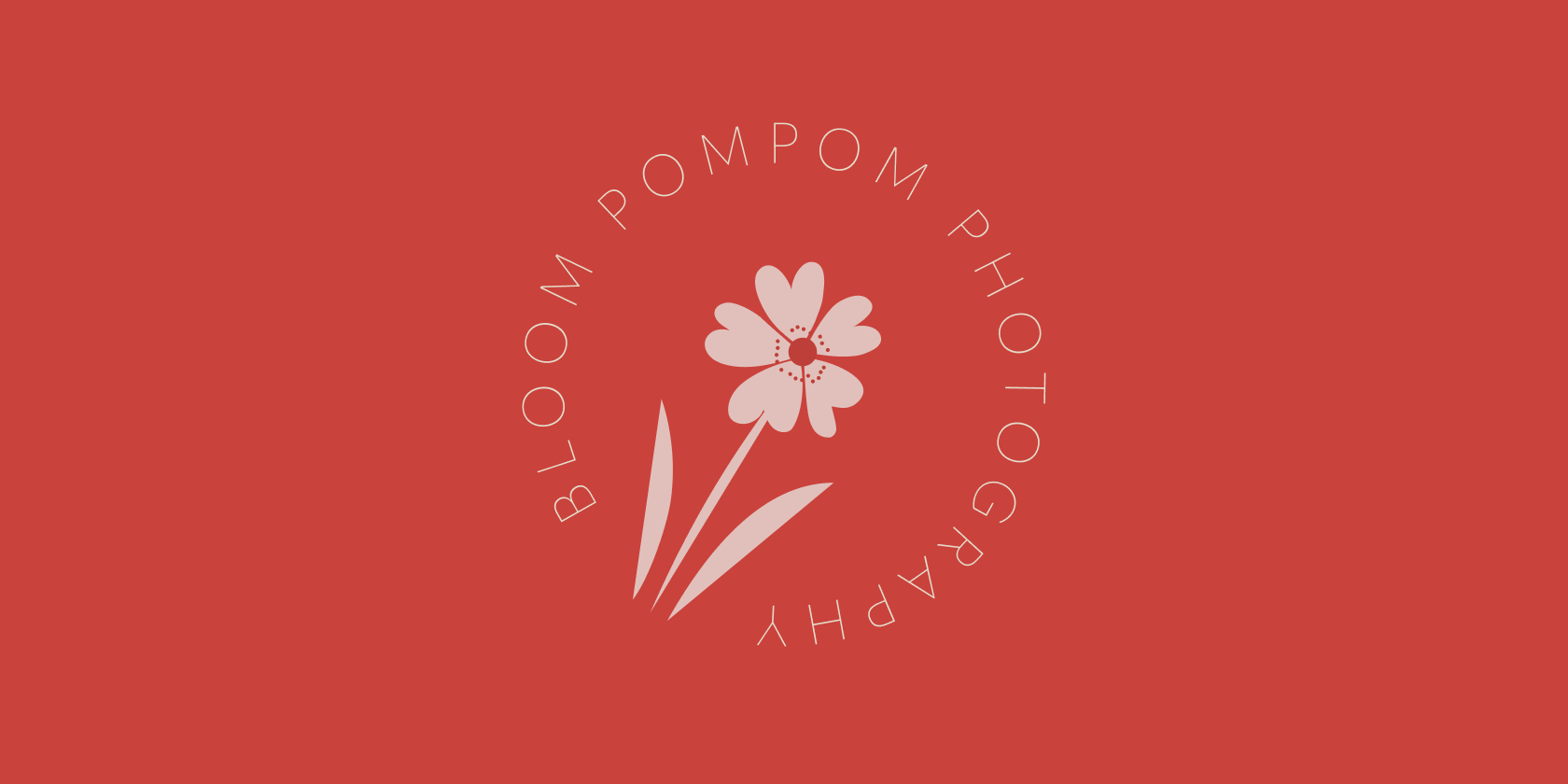
Working from a Pinterest moodboard of textures and colors, I designed the first logo round in black and white only, a deliberate choice, since a mark that works in black and white will work in any color. The client's favorite direction was refined around the anemone japonica, a flower with a twisted stem and overlapping petals, which became the core of the wordmark's floral flourish.
Once the flower and logotype were locked, the palette followed, landing on a red, pink, and beige direction the client felt matched her brand more than the earlier options. The business card was designed double-sided with a different color treatment front and back, a "reversible patchwork jacket" effect the client specifically asked for. Instagram post templates, a price chart, and highlight icons rounded out the kit, all delivered as fully editable files in both Illustrator and Canva so she could update pricing and services herself.
A complete, self-serve brand kit, including a logo (with a bolder Instagram-profile variant), double-sided business cards in two color takes, social templates, and a price chart, gave BloomPomPom a consistent identity across every client touchpoint. The client later built out bloompompom.com on top of it.